
- Red shows huge tankers, blue represents dry bulk ships, and yellow shows ships carrying manufactured products
- Different filters can be added to the interactive map to show port names, vessel routes and different ship types
- Researchers want the map to shed light on how large a carbon footprint is created by the world’s cargo ships
http://www.dailymail.co.uk/sciencetech/article-3562440/Watch-cargo-ships-sail-Earth-s-oceans-Hypnotic-interactive-map-follows-route-giant-vessels-year.html
From the buzz of activity in the East China Sea to the relative quiet of Somalia’s piracy afflicted waters, a new map has revealed the world’s shipping activity in mesmerising detail.
The interactive map provides a fascinating glimpse into hows these shipping vessels navigate through vast oceans as they bring their valuable cargoes to port – but it also serves a more serious purpose.
Researchers want the map to shed light on just how large a carbon footprint is created by the world’s cargo ships. It is estimated that a single large container ship can emit pollutants equivalent to that of 50 million cars.
The issue we were following was the levels of greenhouse gas emissions from cargo ships and their pollution impact,’ Tristan Smith, a reader at University College London’s Energy Institute, told Motherboard.
The data points show the movements of the world’s commercial shipping fleet over the course of 2012. It also shows their fuel consumption every hour.
Shipmap’s website says that ‘billions of tonnes of ships and cargo rely on burning massive quantities of bunker fuel’.
This results in the release of huge amounts of carbon dioxide, which is the main driver of global warming.
Emissions from international shipping for that year were estimated to be 796 million tonnes CO2 which is more than the whole of the UK, Canada or Brazil emit in a year.
That’s 2.18 million tonnes CO2 per day or 90,868 tonnes CO2 per hour.
To create the map, researchers at UCL Energy Institute and Kiln estimated emissions from five different ship types and plotted 250 million data points.
The data is based on hundreds of millions of individually recorded ship positions; plotting all of these at once shows the extraordinary extent of modern shipping’s reach

From the buzz of activity in the East China Sea to the relative quiet of Somalia’s piracy afflicted waters, a new map has revealed the world’s shipping activity. Pictured are the shipping routes for various cargo ships around the world in 2012. Red represents huge tankers, blue shows dry bulk ships, yellow show ships that carry manufactured products, Green gas bulk and purple shows ships carrying vehicles
It was pulled from exactEarth, a company that provides location-based information on maritime traffic, and the Clarksons Research UK World Fleet Register, which registers the world’s fleet
Based only on ship movements and without a background map, the world’s coastlines are clearly defined, with plenty of variation in ship activity, including in areas you might not expect them, such as the Arctic and Antarctic.
The map clearly shows the most crucial shipping thoroughfares of all: the canals linking different bodies of water, such as the Panama Canal, which opened a century ago to connect the Atlantic and Pacific Ocean.
It also shows the even older and busier Suez Canal which saw 17,000 transits in 2012 alone.
To observe the flows of the global economy in more detail, users can distinguish between five different ship types.
The red dots represent huge tankers, the blue dots show dry bulk ships that move cargo like ores, and the yellow dots show ships that carry manufactured products.
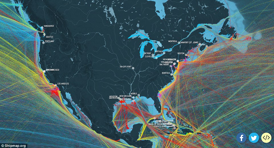
The interactive map provides a fascinating glimpse into hows these shipping vessels navigate through vast oceans as they bring their valuable cargoes to port. The shipping routes around the US are shown here. New Orleans, Houston and Large Angeles appear to be the hub for huge tankers

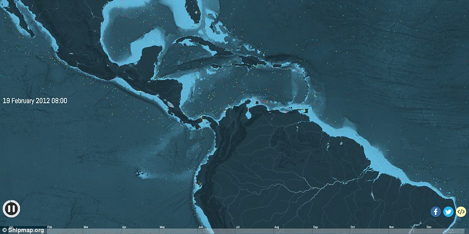
The dots represent the cargo vessels approximate locations around the world on 23 February 2012. Shipmap’s website says that ‘billions of tonnes of ships and cargo rely on burning massive quantities of bunker fuel’. This results in the release of huge amounts of carbon dioxide, which is the main driver of global warming
The map clearly shows the most crucial shipping thoroughfares of all: the canals linking different bodies of water, such as the Panama Canal, which opened a century ago to connect the Atlantic and Pacific Ocean
Green shows gas bulk and purple shows ships carrying vehicles.
It clearly shows the movements of tankers which ship oil from massive terminals in the Middle East or from offshore rigs in West Africa and elsewhere.
It also shows dry bulk carriers moving aggregates, ores and coal from mines and quarries, many of which are found in Australia and Latin America.
Many of these raw materials are shipped to manufacturing regions to make finished goods which are themselves moved back across the ocean in container ships.
UCL-Energy researchers estimated that the map shows roughly 50,000 cargo ships, some of which are over quarter of a mile long.
The next step, they say, is to update their map based on newer data.
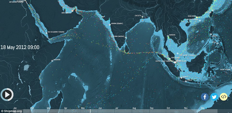
To create the map, researchers at UCL Energy Institute estimated emissions from five different ship types and plotted 250 million data points. The data is based on hundreds of millions of individually recorded ship positions; plotting all of these at once shows the extraordinary extent of modern shipping’s reach. Shown here is shipping movement across the Indian ocean
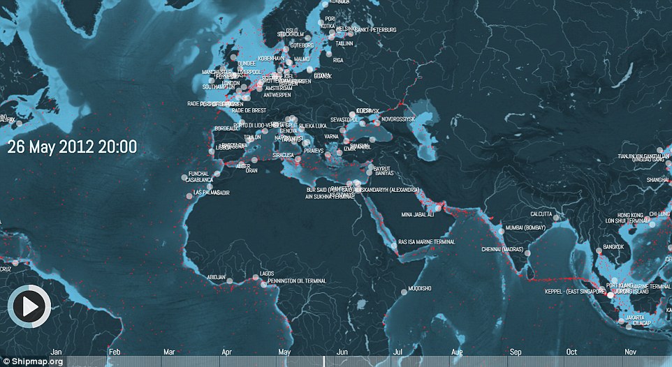
Shown here are the major European pots with the red dots representing huge tankers. The map clearly shows the movements of tankers which ship oil from massive terminals in the Middle East or from offshore rigs in West Africa and elsewhere.